The concrete slab on our back patio has definitely seen better days. It was in OK shape when we first moved in and the humid, damp weather we have doesn’t help it any as the years go by. Several contractors have told us that it …
Suze Orman likes to say that you should learn to organize your own money because no paid professional will ever worry about it or care for it as much as you will. The same can be said for our health records. Yes, doctors and hospitals …
I have been working on clearing off my countertops per my previous post. This has been an interesting and somewhat complex challenge because it forces me to address unresolved storage and organization problems. The countertop is the first place things go when they don’t have …
At the moment, I am a bit frazzled by the Christmas season. I find myself in awe that every year we voluntarily agree to take on all these extra duties. Added to the regular mix of taking care of and educating four children, I am …
Long time no see, Ruly readers! This year has generally come down to a choice between blogging about organizing and actually doing my organizing. I have been working on a lot of great projects but have been terrible about keeping you updated. While I wish …
Scene: The Byrd Theater, Richmond, Virginia, midnight.
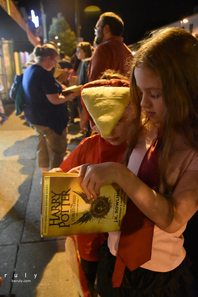
After watching her children fill their summer reading logs with Harry Potter, the Briggs Mother scours the closets for Harry Potter-ish clothing, having a bit of luck that last year’s Halloween costumes included 2 Harry Potter characters.
The Briggs children reluctantly slip into their costumes and are excited by the prospect of being out so late at night. The family loads into the minivan and drives south to Richmond, Virginia during an exciting thunderstorm. Heavy rain falls as thunder and lightning enliven the night sky. Along a country backroad, they encounter a black and white owl (Hedwig perhaps?), frogs are hopping in the puddles and deer hide in the meadows.
They arrive in Richmond just before midnight. The storm has stopped. At the Byrd Theater, a line of people stretches around the block. The crowd is full of Harry Potter fans, some in costume and some wearing more subtle costumes like Quidditch team T-shirts. As the children take their place in line, someone calls out from the crowd, “You are winning at parenting!” People walking by stop to chat with us and admire the costumes.
A few people have these realistic looking stuffed owls.
If they are nice, they might even let you hold it for a minute.
As midnight approaches, the Chop Suey bookshop owner appears in wizard robe and hat and counts down. 10-9-8-7-6-5-4-3-2-1 .. . . the crowd erupts in cheers and bookstore workers cut open the boxes and start distributing books. Everyone starts reading in line.
After a while, the Byrd Theater opens its doors and people stream in. The theater is a gorgeous historic gem, complete with velvet seats, curtains, paintings and carvings on the walls, a balcony and a piano and harp in the wings.
The crowd settles in and after a short wait, a rotation of attendees begin reading from the first act of the book. The Briggs daughters listen to the performance, following along in the book. The youngest Briggs is too excited by the theater and runs through the empty back seats the entire time. The Briggs Mother follows closely behind.
As the reading ends, people begin streaming out of the theater. The youngest Briggs daughter asks to purchase one of the delicious cupcakes being sold in the lobby. The Briggs Mother agrees to get one to share and as the daughter is selecting her cupcake, the cupcake purveyor inquires, “Would you like to try our sorting hat cupcake?” “Oh yes!” the Briggs daughter replies and is rewarded with a chocolate cupcake with chocolate frosting.
The family piles back into the minivan for the drive home with the oldest brother sulking that he wants his own cupcake. Everyone tastes the rich, gooey confection and discovers that the center appears to be peanut butter filled.
I didn’t manage to choose a theme word for 2016 but the word “endure” keeps coming to me of late. 2016 is an odd year! I don’t feel that I am making much progress toward accomplishing anything and that for every step forward I take, …
When I posted a few weeks ago about finishing our math curriculum, I casually mentioned that we will move on to learning JavaScript. Readers Bertie and Mama Paul asked for details on what materials we are using to learn computer programming. Per usual, I will …